When designing a room, the color palette plays a pivotal role in evoking emotions and creating visual appeal. Color psychology, a field that explores the emotional and behavioral effects of colors, is a tool that designers use to craft spaces that resonate with the inhabitants’ desires and needs. The hues on the walls, the finish on the furniture, and the color of the decor—every element works in harmony to energize, soothe, or focus the mind.
At Contempo Space, we celebrate the power of color and offer a plethora of choices to ensure your furniture not only fits the physical dimensions of your room but also the emotional dimensions of your life. With an extensive range of finishes and colors, from the calming matte whites, beiges, and wood grains to the vibrant colored glass options, your design aspirations have no bounds. Our offerings stand as a testament to the potential of personalized design.
The Effects of Colors on the Mind
Colors are not just visual elements; they carry a psychological weight that can significantly impact our mood and perception. Here’s a look at how some colors are commonly interpreted and felt:
Red
Known for its stimulating and energizing nature, red can evoke feelings of passion, excitement, and action. It’s ideal for spaces where dynamic interactions and activities take place.
Blue
The epitome of calmness and serenity, blue is often chosen for bedrooms and bathrooms to create a tranquil sanctuary.
Green
Embodying harmony and growth, green can bring a sense of balance and freshness to a space. Its association with nature makes it a soothing choice, and splashes of green have been shown to mimic the serenity of natural settings, potentially contributing to improved mental health.
Yellow
A color full of cheer, optimism, and creativity, yellow can brighten any room and uplift the spirits of its inhabitants.
Purple
Often associated with luxury, creativity, and wisdom, purple can evoke a sense of sophistication and mystical ambiance.
Orange
Known for its energetic and warm nature, orange can foster a sense of comfort, warmth, and excitement.
Pink
Representing love, kindness, and softness, pink can create a nurturing and comforting environment.
Black
Sleek and sophisticated, black can add a modern, luxurious touch when used judiciously.
White
The color of purity, simplicity, and space, white provides a clean slate, promoting clarity and openness.
Application of Color Psychology in Room Design
Translating the theory of color psychology into practical design is an art and science. The colors of a room can significantly influence its atmosphere and effects on the mind. Here are some tips on applying color psychology to different spaces:
Living Room
Opt for a blend of calming and energizing colors. Shades of blue or green can provide a serene backdrop, while accents of red or yellow inject vitality, fostering social interaction.
Kitchen
Warm colors like red or yellow can stimulate appetite and make the kitchen feel inviting. However, a neutral palette can create a modern, clean, and organized look.
Bedroom
Calming colors such as blue, lavender, or soft shades of green are ideal for promoting relaxation and rest.
Home Office
Neutral colors can minimize distractions, while a splash of energizing color like red or orange can ignite creativity and focus.
Bathroom
Lighter, serene colors can create a spa-like environment. You can also experiment with darker shades for a more dramatic and modern look.
Note that your personal tastes should override any recommendations we make here. What matters most is that you feel comfortable in your own home and enjoy the space surrounding you.
Color Customization at Contempo Space
Customization is your friend when designing your rooms. With Contempo Space, the ability to choose and mix finishes and colors – for instance, selecting a vibrant colored glass front with a calming matte case – allows you to align the furniture with the color psychology principles that suit each room’s purpose.
Moreover, our mirrored furniture options provide a unique opportunity to reflect and amplify the existing colors in a room, creating a cohesive look.
Wide Range of Colors and Finishes
- Matte Finishes: Available in white, black, beige, and various wood grain options, matte finishes are perfect for creating a calm and elegant ambiance.
- Glossy Finishes: Our glossy white or black options can add a modern, sleek touch to your space.
- Colored Glass: With a plethora of colors to choose from, our colored glass finishes allow for a vibrant and contemporary aesthetic.
- Mirrored Furniture: Reflect the existing colors within the room to enhance the color dynamics and create a sense of spaciousness.
Mix and Match
Unleash your creativity by mixing and matching different colors and finishes. Choose one color or finish for the front and another for the sides to create unique, personalized pieces.
Case Studies: Color Choices and Customer Satisfaction
Color psychology is not just theoretical, but a practical design approach that has brought satisfaction to numerous Contempo Space customers. Here are a few instances where thoughtful color selections, paired with our customizable furniture options, have transformed spaces into comfortable, functional, and visually appealing havens.
Neutral Wood Grain on a Pier Wall Bed

Our Lincoln Pier Wall Platform Bed w Mirrored Storagemax Headboard is essentially a closet and bed rolled into one. The wood grain chosen creates a relaxing neutral tone that matches the rest of the decor and is perfect for a rustic bedroom.
Red Armoire

From the Alta Collection, this is the tall version of the Armoire Plus Closet package, fabricated in Sand matte finish with Apple Red glass fronts. It looks like this customer has an excellent eye for design. Notice how well the color compliments the carpeting and artwork in this room.
Icicle Glass and Ash Wood Combined

As said previously, customers are able to mix and match colors and finishes. This customer wanted a room that stayed light and airy with elegant combinations of doors and adjustable shelves.
Aqua Blue Sanctuary
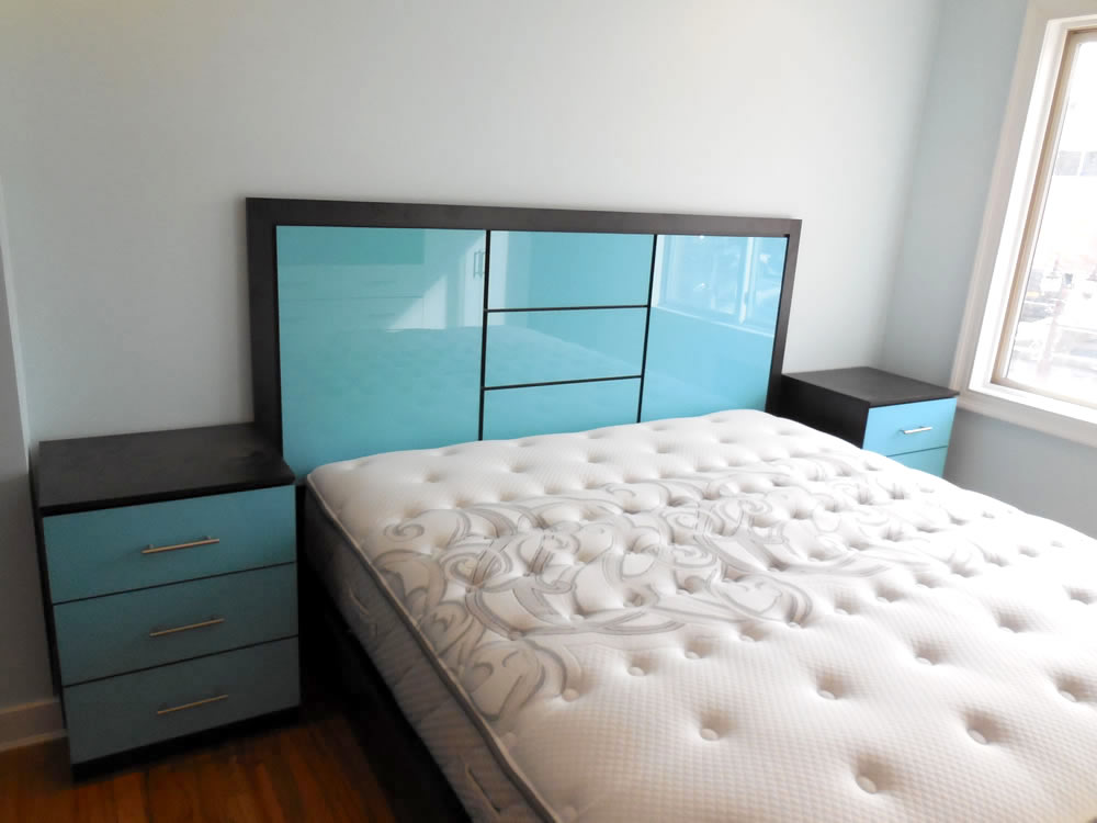
This beautiful bedroom set is built in our black zebrano matte finish and accented with aqua blue fronts. The Broadway headboard matches the nightstands and platform bed perfectly.
Glossy White Wardrobe
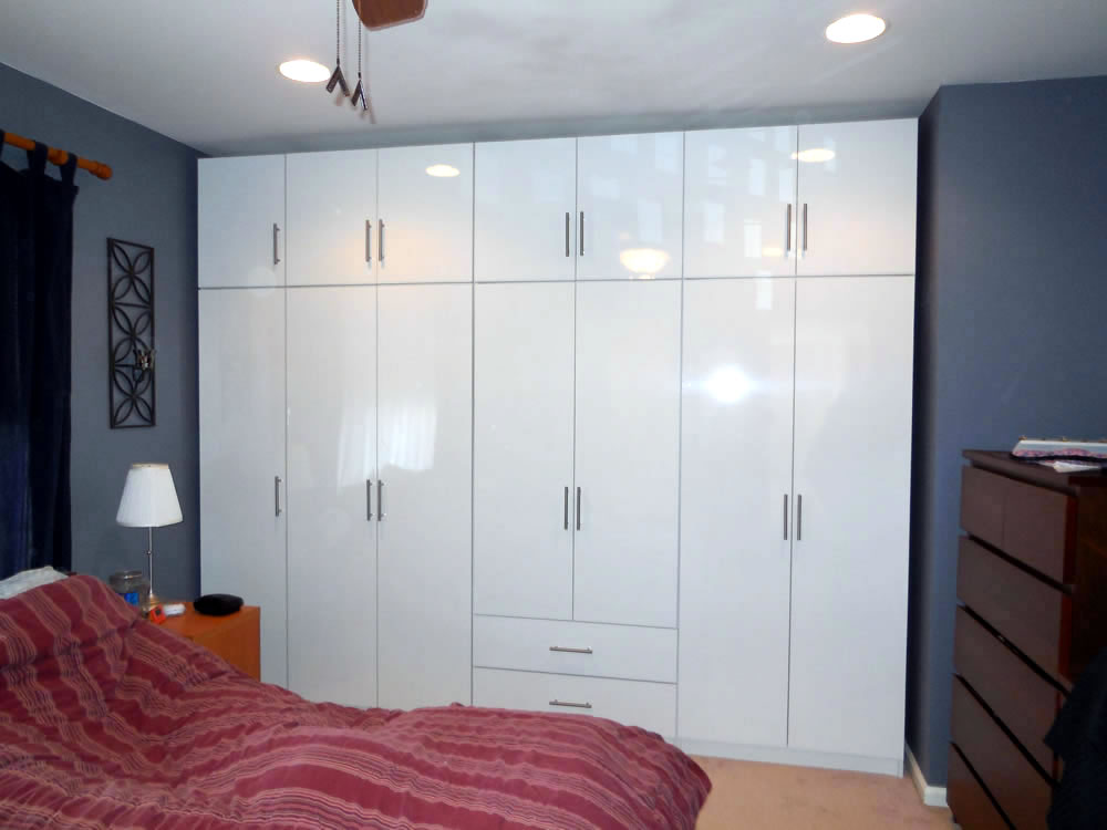
The wall of wardrobes pictured is simply several free standing closets attached together in place. They chose a glossy white, which feels pure and elegant.
Unleash Your Color Creativity with Contempo Space
Now that you’ve traversed the spectrum of color psychology and seen how it intertwines with interior design, it’s your turn to create a palette that resonates with your lifestyle and aesthetics. At Contempo Space, we’re here to facilitate your color journey every step of the way.
Explore our extensive range of finishes and colors, and revel in the freedom to mix and match to your heart’s content. Whether you’re drawn to the calming hues, the vibrant tones, or the sleek modernity of glossy and mirrored finishes, your choices are bound only by your imagination.
Visit our showroom in Passaic, NJ, contact us, or browse through our online catalog. Our design experts are ever ready to assist you in crafting furniture that’s not just a fixture, but a reflection of you.